MovableBlog: Yahoo! Search First Impressions
April 7, 2003
Well, the new Yahoo! Search passed the first test: I didn't go blind. Okay, Simpsons references aside, the first test was "Does it look good in Phoenix?" Almost (see below). Second test: "Does my name come up first?" Yes.
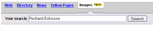
Here's what I mean by almost looks good in Phoenix: when searching for my name (to see if there are photos of me floating around there on the net), then clicking Images, the bottom Images tab is broken by 1 pixel too many:
I like the little tab indicator telling you which part of Y! Search you're in (despite the above), and I also liked that the search box was available at the bottom of the results (with an extra option to exclude words). I also like that it's relying on CSS positioning (and, to be fair, still with tables) as well as CSS for the formatting, unlike the main Y! pages, which uses ungodly font tags.
To be quite honest though, I wouldn't use it unless it was on the front page. The Y! main page is still way too cluttered, and I use it only for news headlines. Typing "search.yahoo.com" is not as muscle-memory-friendly as "www.yahoo.com". (Why not just set it my 'home' page, you ask? Well, what the times when I use someone else's computer?)
The tabbed interface of the 'index' page is kinda neat though, and including words in the URL while excluding words in the page one-ups Google, but Google still beats Y! in terms of number of elements of the page you can search.
Anyway, just first impressions. Surely there will be more detailed analyses elsewhere, as well as remixes of the site by various designers.